Accessibility in psychology exams
22 March 2023
 Nicola Heath, Psychology Subject Advisor
At OCR, we are committed to making exams fair to all our students. In this blog I’ll explain why accessibility is important, and what we’ve been doing to improve accessibility in psychology exams.
What is an accessible exam?
Accessibility is not about making exams easier. This is a common misconception. Making the exams more accessible is about fairness to our students. If we can simplify the way we ask questions, this makes it easier for all students to understand what is being asked of them. This in turn means we are creating a more valid assessment which is testing what it should be, which for us is psychology knowledge, understanding and skills.
Why is it important?
Some students can struggle in exams due to the layout or wording used in the question paper. This could be due to their ADHD or dyslexia for example.
Having too much irrelevant content or having very large amounts of text bunched together can increase cognitive load for students. This may impair their ability to read and understand the demands of the question which could affect their performance.
At OCR we are committed to improve accessibility of assessment materials, including exam papers, so that students can access the content and be assessed fairly.
How can psychology exams become more accessible?
The content and layout of the exam paper may, if necessary, be altered to reduce cognitive load. For example:
- Using an Arial font, which has been recognised to be more readable.
- Centring headings for easy navigation.
- Leaving a line between the context given in a scenario and the question itself.
- Using bold text for important words only, such as the number of points needed.
- If a question asks for two or more points, having numbers against the lines for the correct number of items needed.
Below are some examples from psychology exam papers to show some of these accessibility suggestions.
Example 1

There is clear spacing for the criteria of this question. If all this information had been in one paragraph, it would have been challenging for students to work out what was expected of them. (H567/01, 2020).
Example 2

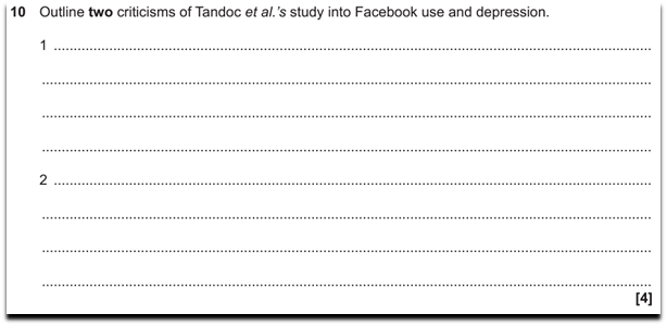
There are two points to note in this example. Firstly, the use of bold to highlight that two criticisms are needed. Secondly, the numbers 1 and 2 used to help students structure their two points. (J203/01, 2020).
Example 3

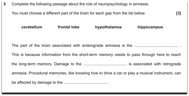
There is sensible line spacing between instructions and the question. The terms needed to fill the gaps are on a separate line, evenly spaced and in bold to make them clear to students. (J203/02, 2020).
Example 4

The word ‘and’ is in bold to emphasise to students that they need to include both similarities and differences within their answer.
Summary
We hope this has given you an insight into what accessibility means for exams and shown you some examples from psychology. We will continue to update and improve our accessibility criteria for all exams and we are committed to helping students have a fair chance at demonstrating their knowledge and skills.
If you are interested in some further reading on this area, Ofqual published a guidance document based on a 12 week consultation that took place early in 2022.
Stay connected
Share your thoughts in the comments below. If you have any questions, you can email us at psychology@ocr.org.uk call us on 01223 553998 or tweet us @OCR_Psychology. You can also sign up to subject updates to keep up-to-date with the latest news, updates and resources.
About the author
Nicola joined OCR in 2022 as the Subject Advisor for Psychology. Prior to joining OCR, she taught psychology for over 10 years and has had various other responsibilities in that time, including being Head of Year and Subject Leader. Outside of work, Nicola enjoys reading, baking and spending time outdoors.